Newbies App
Role
UX Researcher, UX/UI Designer
Project
Academic Study - Solo
Year
Sep - December 2022
During my UX Design Bootcamp at BrainStation, we were tasked with completing a capstone project over the span of 12 weeks. This project was an end-to-end UX design process that involved designing a digital solution for an identified human-centred problem.
In this case study, I will provide an overview of my research, the design process, and the testing phase, detailing how I developed and improved the user experience of my app Newbies. This case study showcases my skills in UX design and my ability to apply user-centred design principles to develop a successful and intuitive application.

My process for this design challenge was to leverage a non-linear design-thinking methodology. Through this human-centred approach, the goal was to design a desirable solution that addressed users’ real human needs.
My Design Process
-
Finding a Problem Space
Secondary Research
Primary Research
-
Persona
Experience
Intervention Point
-
User Stories & Epic
Task Flow
-
Exploratory Sketches
Lo-fi Wireframes
-
Usability Testing
Incorporating Feedback
-
Brand Development
Hi-Fi Prototype
Starting Point & Motivation
Like many of us, I lived alone and worked from home during the pandemic. On top of this, I decided to move to a new city where I didn't know many people at the height of it. I missed my friends, and I missed meeting new people. But I realized that through the pandemic the way I approached new social situations had changed, which led me to research the impact of the pandemic on social interactions further.
Empathize
Problem Space
Young adult Canadians have been disproportionately impacted by a number of pandemic stressors. According to a study by the mental health commission of Canada, more than 60% Canadians age 18-30 have reported a worsening in their mental health in the last 3 years. As recommended by the BCCDC (BC Center for Disease Control), we must seek opportunities to increase community belonging and inclusion as it is fundamental during the pandemic recovery period yet still 48% of youth 18-24, have reported feeling lonely and isolated as we emerge from the pandemic.
I (27F) recently moved from Boston, MA to Dallas, TX. I work remotely and I’m single. I also don’t have any family in the area. I’ve joined some [Facebook] groups in hopes to make friends through meetups
- Anecdotes from a Forbes article on loneliness through the pandemic
Secondary Research
Activities and the outdoors help mental health. Yoga, meditation, exercise, and walking outdoors were the most common set of coping methods.
How Might We…
How might we facilitate new connections between young Canadians and their peers so that we can lessen the negative mental health impacts of social isolation as we emerge post covid?
Primary Research
For my research into this problem space to build my user persona and find more insights into how long people meet and connect with new people, I conducted 5 user interviews with people I selected based on my pre-determined participant criteria.
I conducted interviews with people who are aged 18-30, Live in Canada and lived alone during the pandemic or had moved to a new city during the pandemic
Affiliate Mapping
After conducting my interviews I synthesized my findings into an affiliate map. From my interview transcripts, I pulled keynotes and sorted them into motivations, frustrations and behaviours. I then grouped them based on common themes and insights began to arise.
Key Themes & Insights
1. Everyone at some point has found it difficult to meet and maintain new friendships as an adult
2. Social anxiety has increased around new people and groups in the years since the pandemic.
3. Activities allow an individual to socialize and engage at a level that is comfortable to them as the focus is on the activity rather than “meeting
4. Moving to a new city increases loneliness and difficulty meeting a network of friends
While all of the themes did influence my digital solution, I chose to focus on insight #1 — That Everyone at some point has found it difficult to meet and maintain new friendships as an adult, and Insight # 3— that Activities allow an individual to socialize and engage at a level that is comfortable to them as the focus is on the activity rather than “meeting friends” as a secondary insight.
Through these interviews, I also found that many of these themes were not unique to covid. People often felt the same isolation and loneliness when moving to a new city therefore I felt it was important to revisit my original HMW to not limit it to covid times.
Revised How Might We…
How might we help facilitate and foster friendships between people new to a city so that they feel integrated into a community?
Define
Persona
With all the information I gathered from my secondary research and interviews, I synthesized it to develop a persona that would allow me to portray my target user. Having my persona at the core of my design decisions ensured that I always had the user in mind.
Experience Map
After developing my persona, Aiden, I created an Experience Map to get a better understanding of his journey. By defining the stages of their experience as a young adult who had recently moved to a new city I would be able to pinpoint the ideal moments of opportunity where I could intervene with a digital solution.
Where to intervene and why?
Since the steps needed to fulfil the feeling of wanting to join something and meet new people in step 1 lead to 3 different ways to go about this, all unsuccessful, I thought simplifying steps 2-4 into one digital solution would be a good way to approach how to help solve Aidens frustrations
Ideate
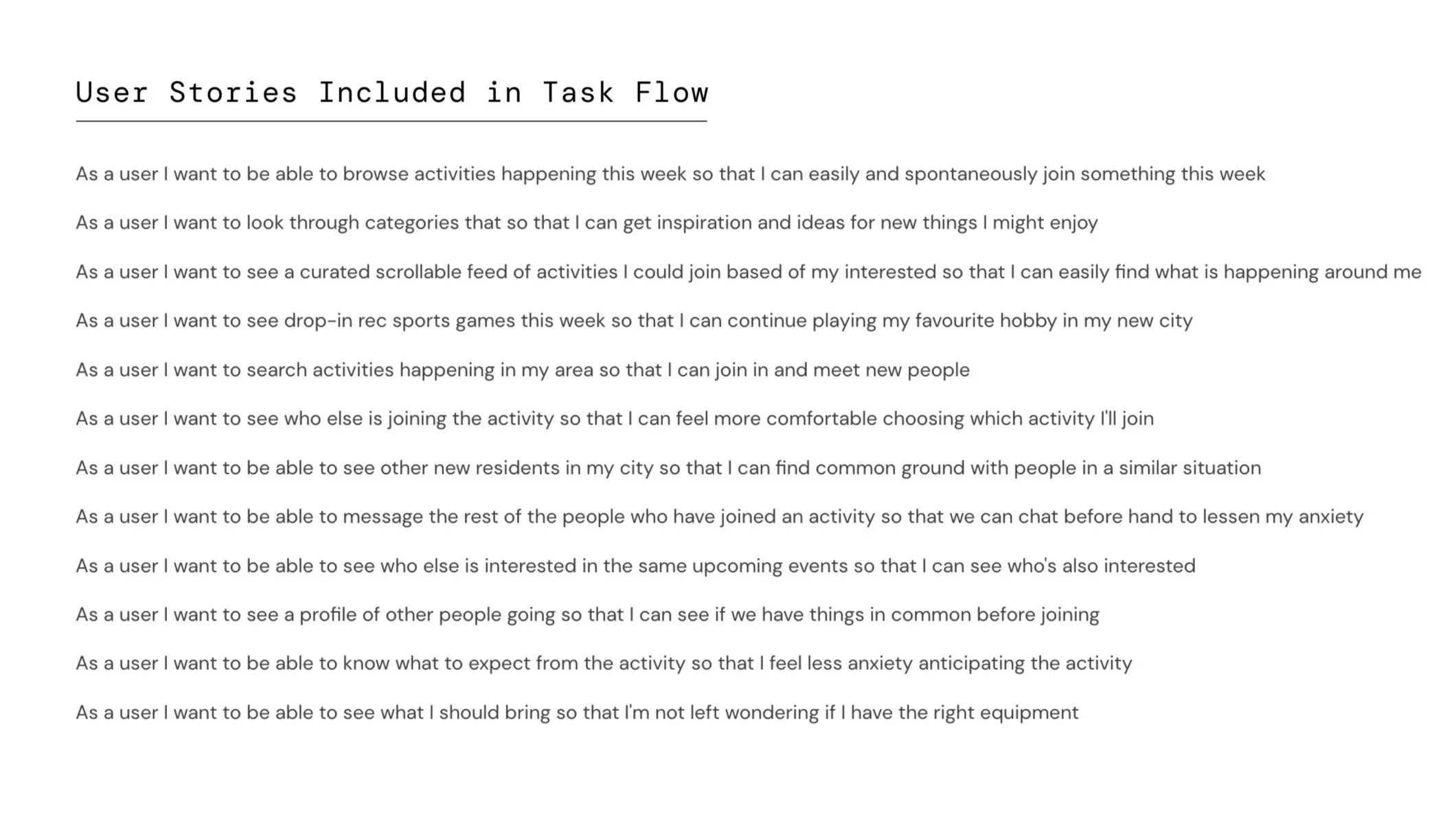
I authored my user stories by building on my persona and user experience map, as well as drawing inspiration from the themes and user insights I gained from my interviews. While these are authored from the perspective of my persona "aiden" I have used "user" for a more inclusive and general statement.
User Stories

After identifying key moments where I could intervene, I moved into the “ideation” phase of problem-solving where I began to explore User Stories and Epics to see how users like Aiden might use digital solutions to help them find a community in a new city.
Chosen Epic & Relevant User Stories
The user stories included in the task flow are primarily from the epic of "finding an activity to join" however a few from secondary epics, like "safety and security" felt relevant to the flow so I have chosen to include them as well.
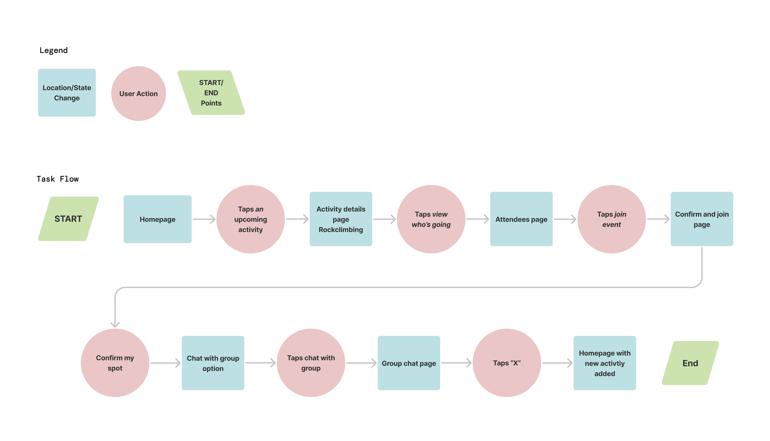
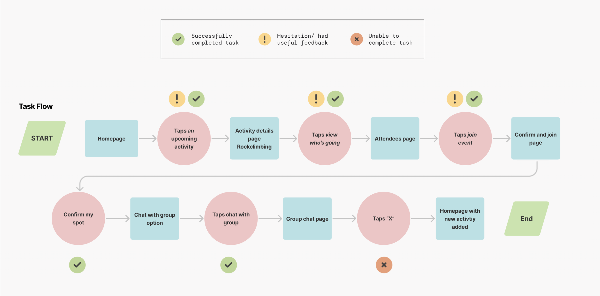
Task Flow
I designed my task flow as a user (Aiden) browsing activities and then joining the selected activity. I created a task flow diagram that would show how an individual could complete their main task of joining an activity.
Epic & Task:
Browsing and joining an activity
Persona
New user Aiden has just completed onboarding and setting his preferences and is now looking for an activity to join
Prototype
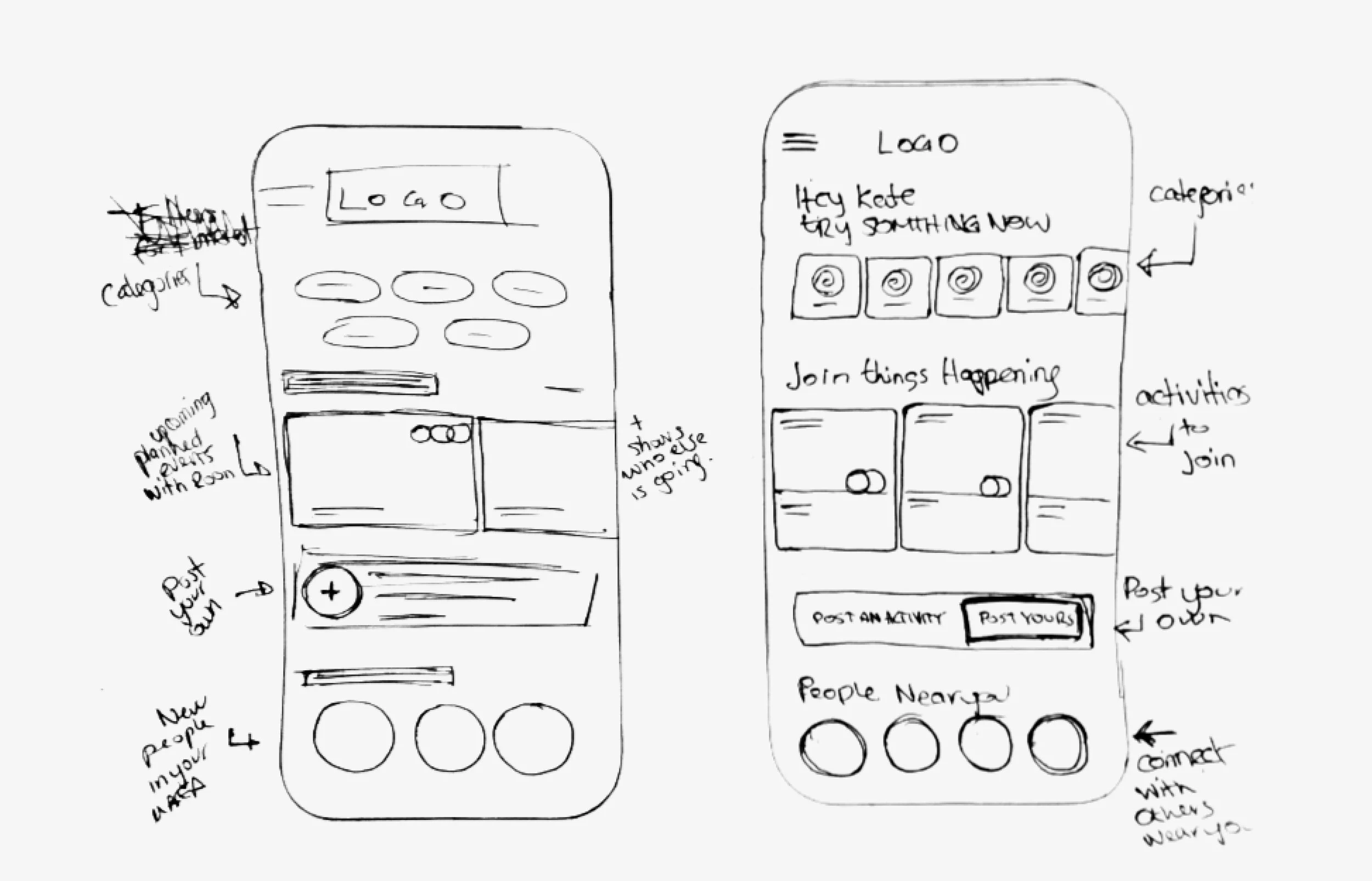
Sketching
After gathering some UI inspiration and creating some moodboards took pen to paper and explored how my task flow and content could look laid out on a mobile screen.

Wireframes
After I felt I had thoroughly explored content and layout iterations for my task flow I selected the most viable sketches as my solution and began to translate them into low-fi wireframes in figma.

Test
With the initial prototype built, I then conducted 2 rounds of usability testing with 10 different individuals to get feedback in real-time while they completed the 6 tasks necessary to go through the flow of joining an event and messaging the group.
I created a testing plan to help conduct my usability testing in order to observe how potential users might interact with the product and gain insight into the usability of key features.
Purpose of test: To understand the usability of browsing and joining and activity flow and to find out where we can optimize the flow by observing our users.
Total number of tests & testers: 1 flow of 6 steps (tasks) was tested with 10 people. 5 people for V1 prototype and 5 people for v2 prototype.
Where: Tests were conducted over zoom and in person.
How: Testers clicked through the prototype on their own desktop while sharing their screen, while I took handwritten notes. Or tester tapped through the prototype on their phone while I observed over their shoulder and took notes.
Overview of Usability Issues
Overall, almost all testers successfully completed all tasks asked, though some had hesitation or wondered out-loud before ultimately choosing the correct path. While navigating through the flow they gave great insight and suggestions to help streamline the process and improve the users comprehension of each step.
Design Revision Prioritization
After each round of testing, the feedback and insights from the testers were prioritized using a Design Prioritization Matrix. This allowed me to assess the effort it would take to fix and the value it would bring to the user.
Improving the Designs
By referring to the Prioritization Matrix and evaluating the time constraints I was working with, I tackled the suggested improvements I knew would be the most impactful by weighing the value brought to the user and the effort required to implement them. Luckily, I could implement additional improvements down the line when the time wasn’t as much of a constraint.
After creating my prioritization matrix I worked through each quadrant in prioritization order and made updates accordingly. I felt all changes were important and luckily were within scope so I was able to address each one. The changes are outlined below.
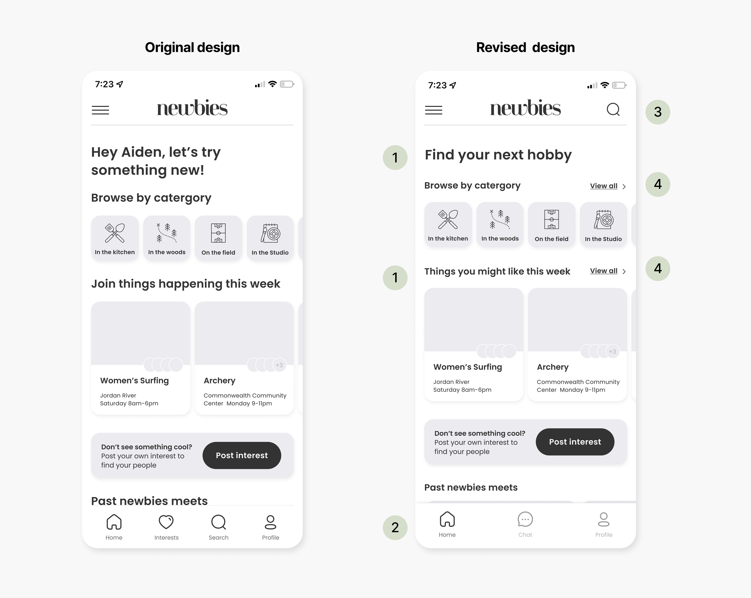
Changes to the homepage
1. I changed the headlines to better explain what the overall action is intended for the homepage and to more directly tell the user what to expect in each content section
2. I simplified the lower navigation screen to just 3 icons. I removed interest as it would now be in the settings/preferences menu, added the chat/messages tab and moved the search bar to the top right of the screen.
3. I moved the search bar to the top right for better consistency and standards
4. I added "view all" options to categories to take you to a page with all the relevant content visible at once
Changes to the attendees page
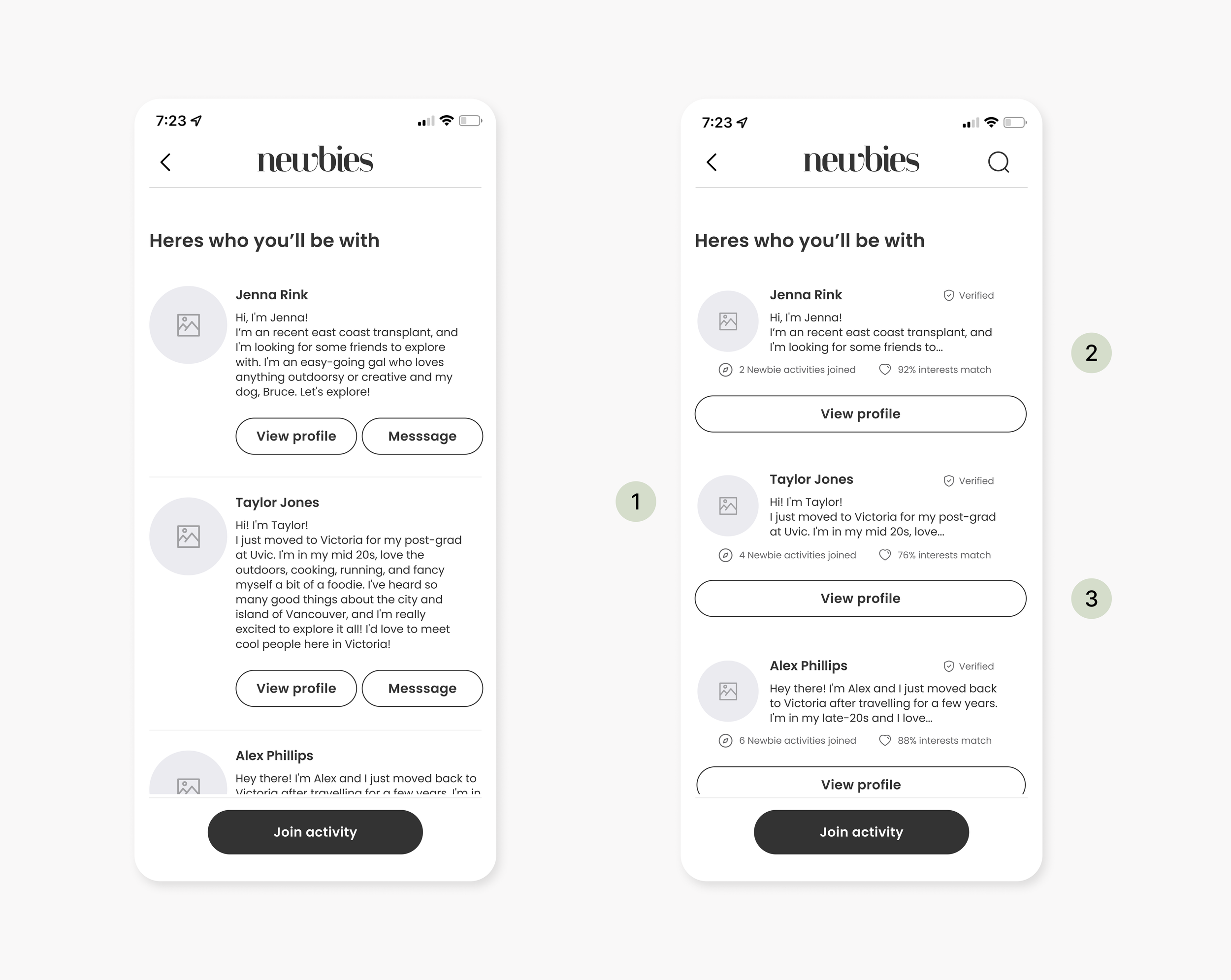
1. I decreased the profile image size to better fit the content
2. I shortened bios to just a preview with the option to continue to the profile if interested
3. I simplified the button options from having two actions with a similar style to the main CTA to having one option in a secondary style
Changes to the chat page

Users were having difficulty navigating back to the homepage from this screen. Users would press "back" which originally led back to the confirmation page.
1. I removed the back button as it was confusing for the user to choose between “back” and "x"
2. Hoping that the new simplified lower nav with help users navigate back to the homepage
Refine
Brand Development
With testing done and having an improved greyscale prototype, I was ready to bring the design into High-Fidelity by developing and applying a brand and visual identity.
I started my brand exploration by writing down as many words that came to mind when I thought about my App. I then narrowed the list to the word that gave me a strong visual association or feeling that fit my vision for the app.
Name Exploration
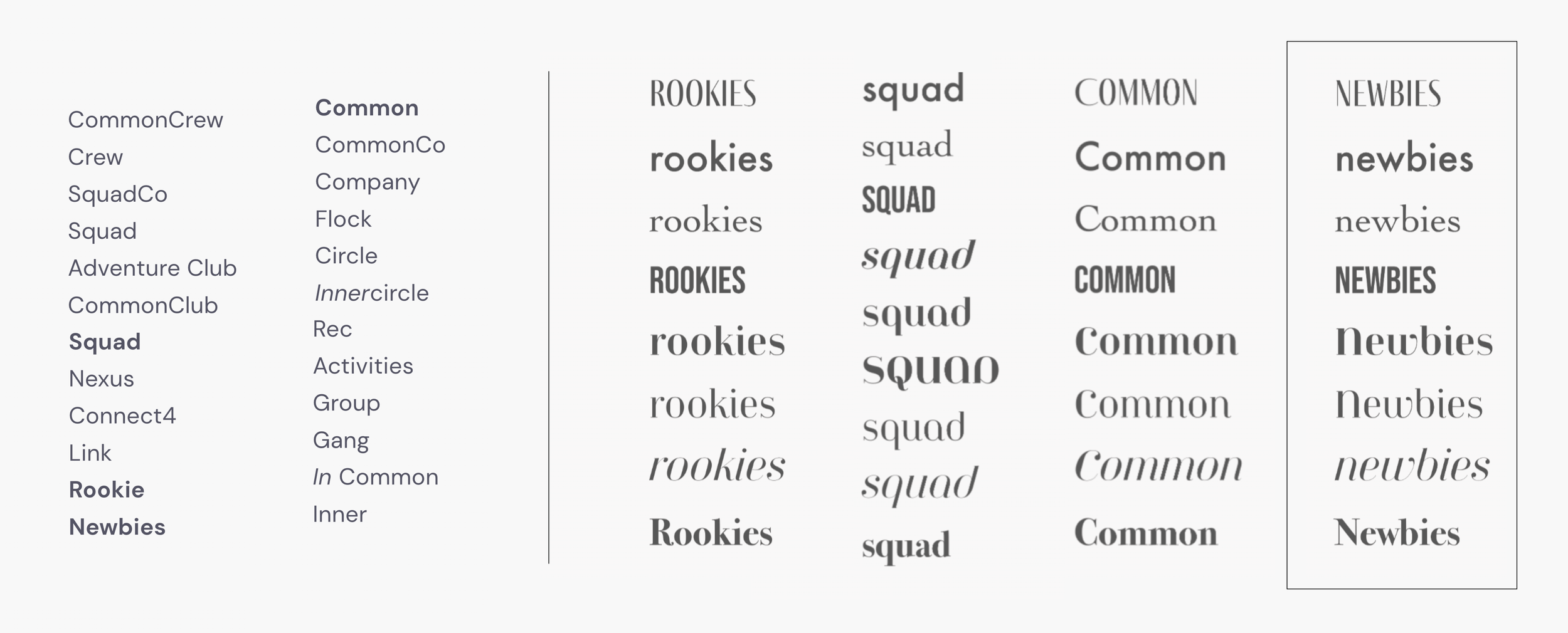
Throughout my low-fi app designs, I kept a list of possible names for my app. I then chose 4 to explore further designs with.
I went back and forth quite a few times deciding on a name. But after discussing with friends family and peers I ultimately chose Newbies as it felt straightforward to the function of the app yet still held multi-meanings and a playful tone.
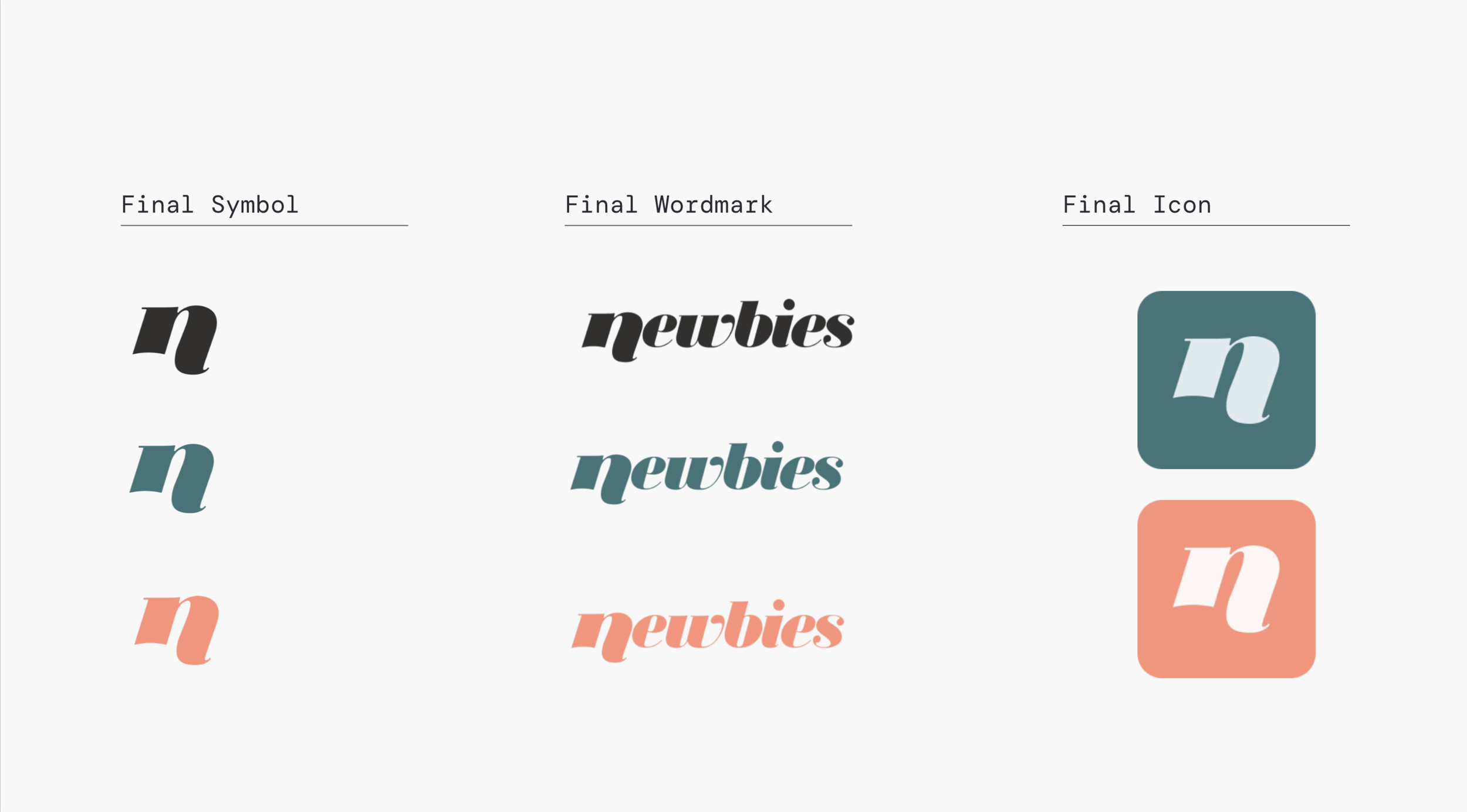
Final Wordmark & Symbol

After many typeface explorations, I chose the typeface Jeanne Moderno OT, UltaItalic for my final wordmark.
I explored ways to customize the wordmark resulting in adding a simple curve to the baseline of the “n” that matched the angle of the rest of the letters and then extended the descender below the baseline to mimic the emphasis of capitalization but still conveying the fun and casualness of all lower case.
I chose to isolate the "n" from the wordmark for the symbol.
Colour, Logo Variations and App Symbols

Photography Moodboard

High-Fidelity Wireframes
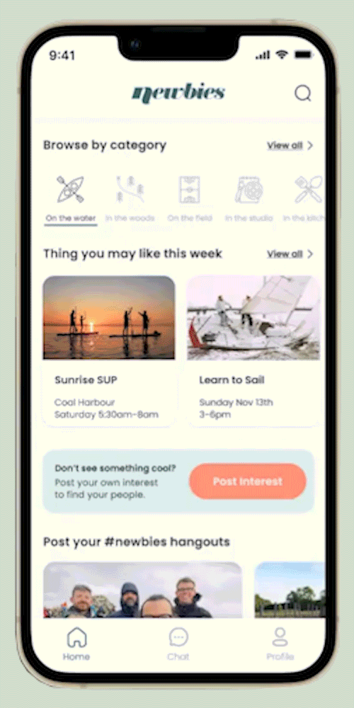
I then injected colour, photos and more content into my wireframes. I wanted to keep the colour use to a minimum and use the accent colours for CTAs or subtle interactions or states.

High Fidelity Prototype

UI Design System

I then created a UI Design system to set standards and consistency for Newbies as it grows. I followed an atomic design system and have included a modular set of atoms, molecules, organisms, templates and pages. You can see an online PDF of my design system here
Future Thinking
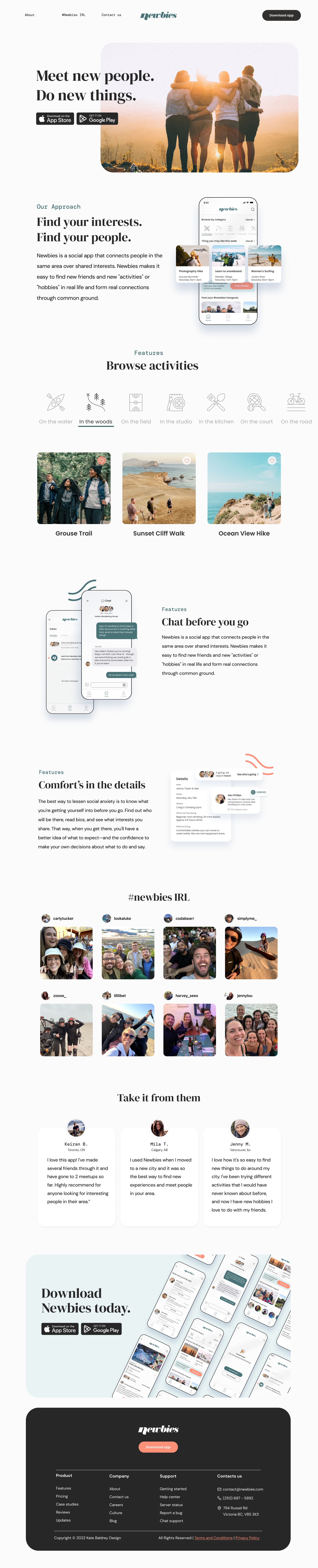
Marketing Website
After developing the Newbies App we needed a landing page to drive traffic from our advertisements and organic searches to, and ultimately convert the curious browser to download the app and become a newbies customer.
I wanted the brand marketing of newbies to be an extension of the brand and UI we see on the app, but felt it could have a bit more distinct style choice through font varieties and photography, both curated and organic, to visually communicate the key features; finding friendships & adventures.